CarrefourSA Super App Design
B2C super app design focused on seamless navigation and a scalable design system.
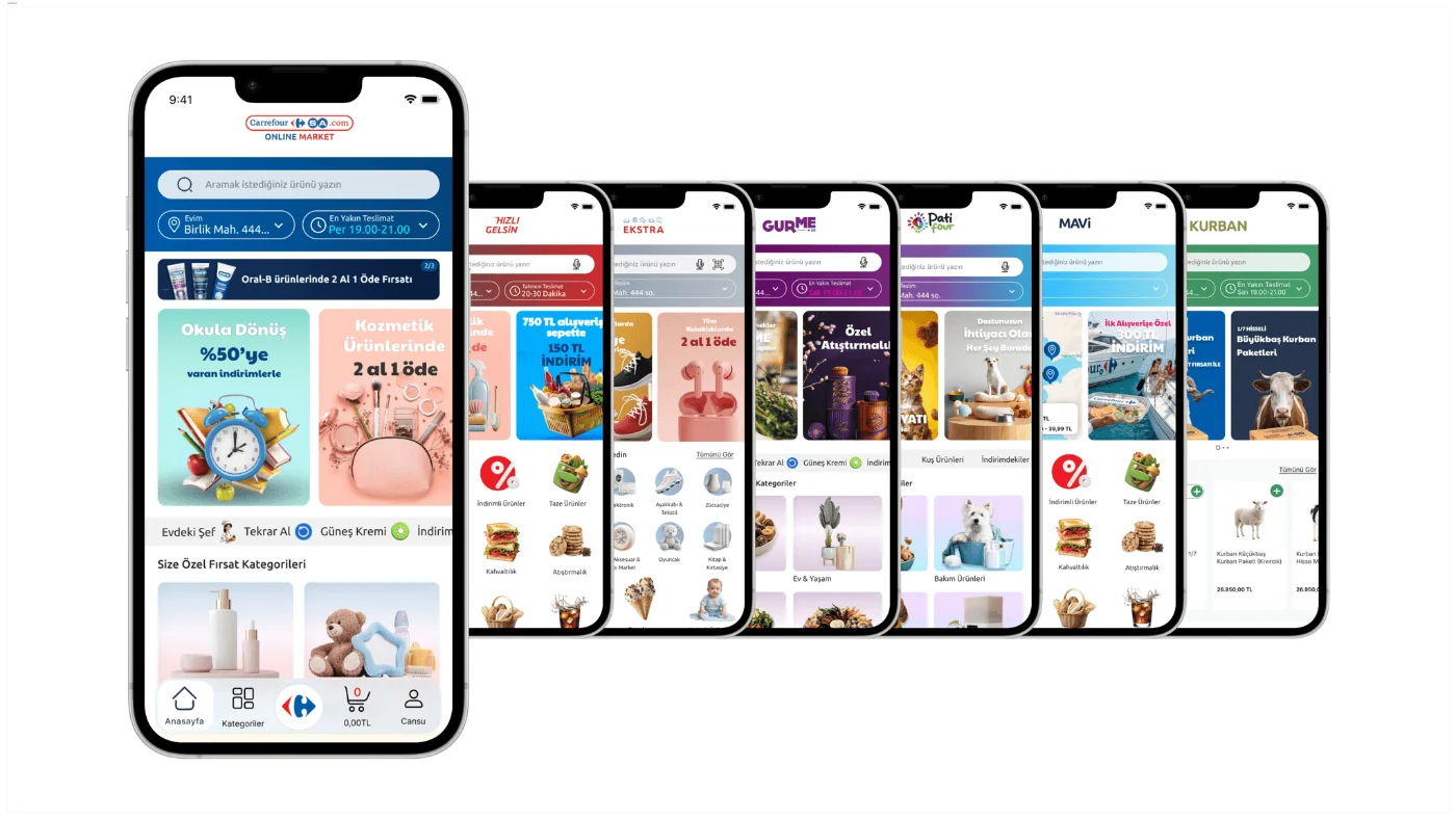
I own the end-to-end web and app experience for this B2C super app. I work closely with PMs and developers on a daily basis, and hold weekly design reviews with the client to iterate across modules including Online Market, Hızlı Gelsin, Ekstra, Gurme, Patifour, Tekne, and Kurban.
To keep the visual language consistent as content scaled across modules, I put together a visual asset guideline covering banner layouts, type sizes, safe areas, and more.
Note: These designs are shared for portfolio purposes only. Unauthorized copying or commercial use is strictly prohibited.
Online Market
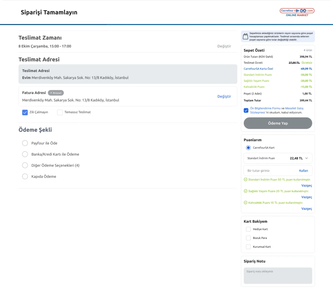
Online Market was the module I spent the most time on. The goal was to create a new design language tailored to the super app experience. This module also became the foundation that later guided other modules.
One design decision evolved several times: where to display card balance and loyalty points. I initially placed them in the cart so users could see their discount before deciding what to buy. However, the client preferred showing them at checkout to mirror the in-store experience, where the CarrefourSA card is presented before the final total is calculated. Since users were already familiar with this flow, I moved the balance and points display closer to the payment step.
Hızlı Gelsin
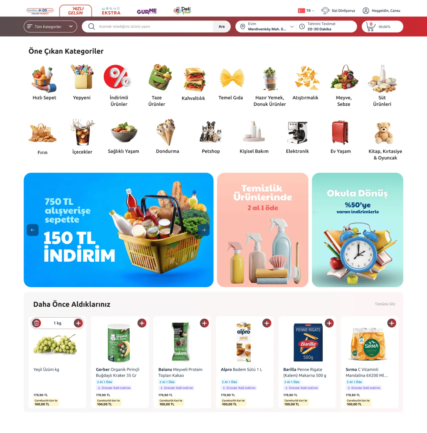
Hızlı Gelsin targets a different persona than Online Market. Online Market prioritizes discovery, placing recommendations and curated picks at the top, with categories as a secondary path.
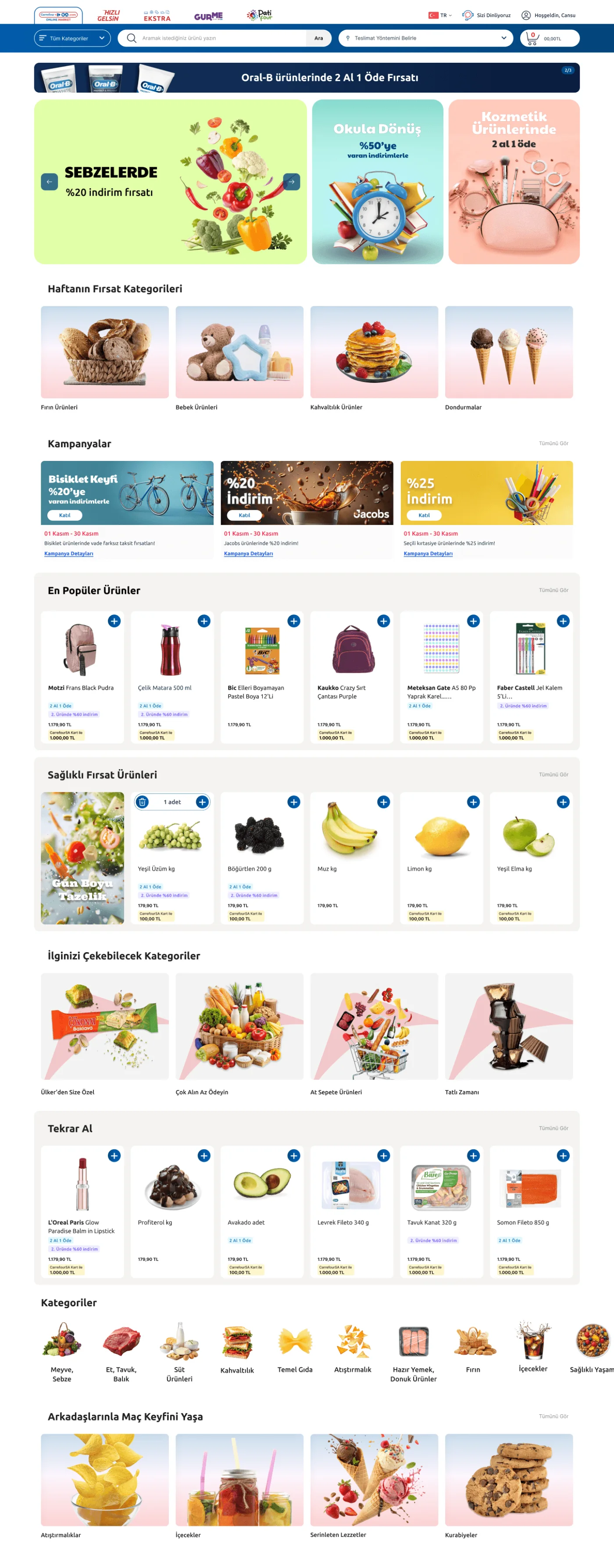
Hızlı Gelsin prioritizes speed, leading with a category grid, followed by campaigns and a section to support quick repeat purchases. The experience is designed to get users from open to checkout in as few steps as possible.
Ekstra
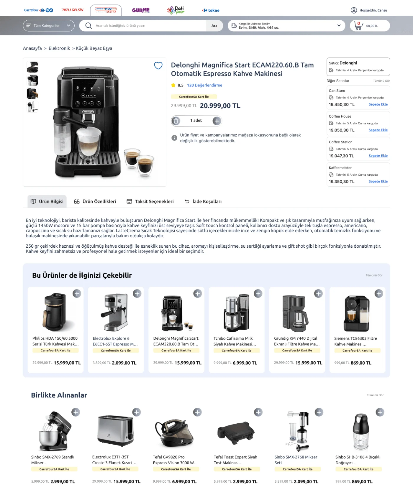
Ekstra operates like a marketplace, with products coming from multiple vendors. This introduces variability in price, stock, and shipping conditions for the same product, depending on the seller.
The product page showed other sellers offering the same item, with their price and delivery time.
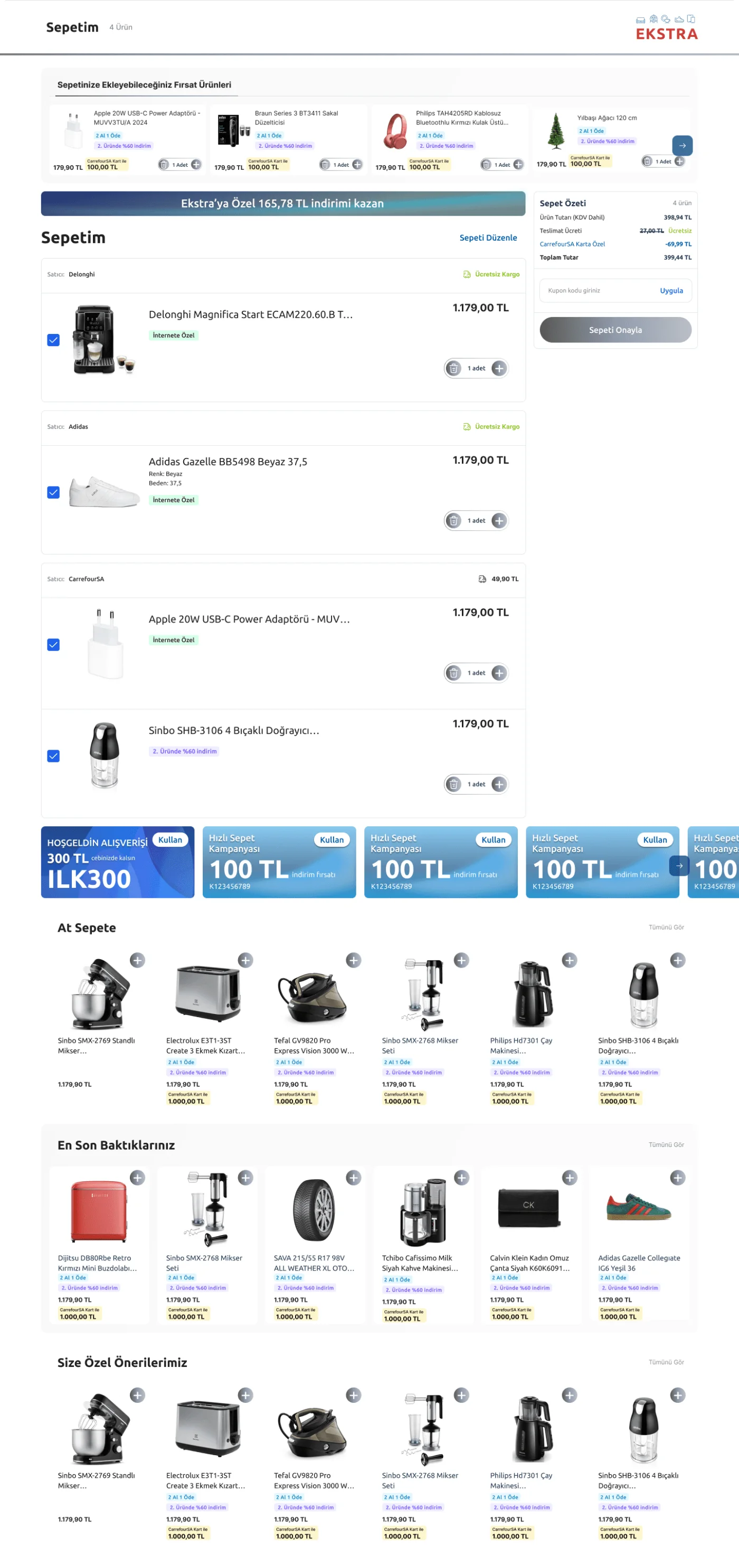
The bigger challenge was the cart. Since items came from different vendors with different shipping terms, I grouped products by seller while maintaining a single cart summary and checkout flow.
Gurme
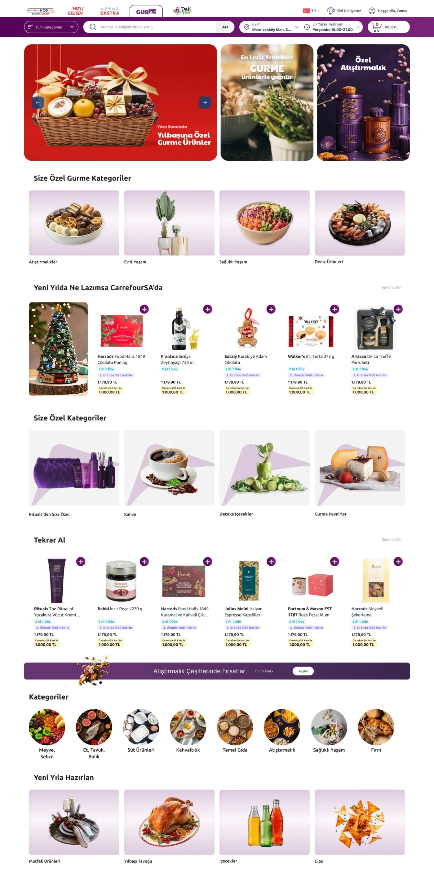
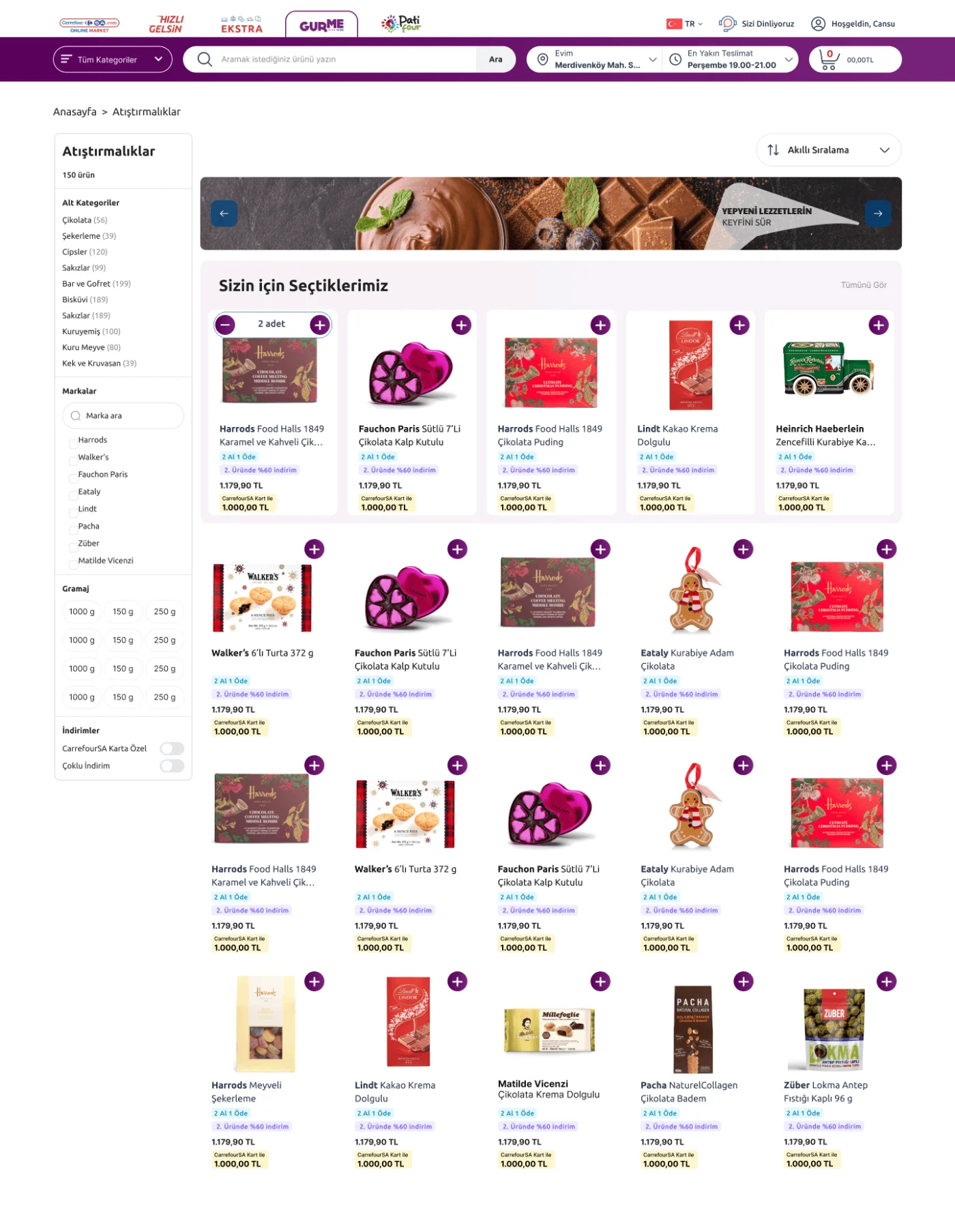
I designed a premium visual language for Gurme to reflect its focus on imported and premium brands. Carefully selected product card patterns, softer tones, generous whitespace, and editorial-style banners create a calm, elegant experience that supports discovery.
The main challenge was balancing this editorial feel with the need for fast conversion. I prioritized storytelling elements like banners and lifestyle imagery at the top of the page, while keeping quick add-to-cart actions within product cards.
Patifour
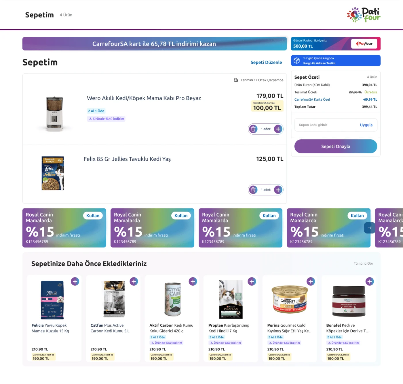
Patifour offered two delivery methods, in-store pickup and shipping, based on the nature of the products. The original design allowed users to mix both within a single cart, but this proved unworkable due to separate stock and logistics systems that couldn’t be synced in one flow.
We separated the experiences instead. Users selected their delivery method upfront, before browsing, and the catalog adjusted accordingly.